I apologize in advance… I’m tapping into my “geek” side today.
I want to talk about something called the Phillips Curve.
Some readers might’ve heard this concept mentioned before…
The Phillips Curve was a key part of financial markets many decades ago. It fueled a strong narrative involving stock prices, employment, and wages.
The Phillips Curve even influenced U.S. monetary policy through the 1960s.
And it worked well…
That is, as long as employment and inflation trends fell into predictable patterns.
While the Phillips Curve is an elegant theory, it has grown weaker over time. And ultimately, it lost favor among industry experts.
But as I’ll explain, it’s also helping to reshape our monetary policy…
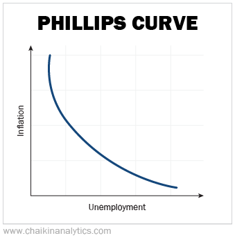
The Phillips Curve dates back to a 1958 paper published by economist A.W. Phillips. It focused on wage and employment data from the United Kingdom.
Based on this data, Phillips derived an “inverse” relationship between wages and employment. Economists later expanded “wages” to include general price levels (“inflation”).
In other words, as unemployment increases, wages and inflation decrease. On the flip side, lower unemployment leads to higher wages and higher inflation. Take a look…
Today, the Federal Reserve is pushing for higher unemployment to get inflation under control. And many folks presume it will keep raising interest rates in an attempt to get inflation down to its target of 2%.
To get a clearer picture of the Phillips Curve, we need to consider more data…
Kevin Kliesen is an economist with the Federal Reserve Bank of St. Louis. He analyzed U.S. data from the 1950s and 1960s to confirm the relationship between unemployment and inflation.
I downloaded Kliesen’s data from the St. Louis Fed’s data portal. And I created the following scatterplot to interpret his analysis…
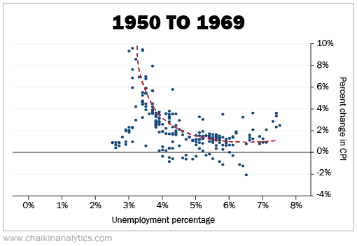
Look at the (approximate) trend line summarizing these data points. It starts at the upper left and ends near the lower right.
In other words… it’s similar to the Phillips Curve.
You can see a gentle curve with the sharpest turn near the 2% level for the Consumer Price Index (“CPI”) and the 4% level for unemployment.
It’s not perfect. But the Phillips Curve supported this general pattern.
However, this idea cracked in the 1970s. That was a period of “stagflation” in the U.S. as high unemployment and high inflation happened at the same time.
The Phillips Curve suggests that stagflation can’t happen because those two variables are inversely related. But as those of us who lived through it know… it did happen!
In the 1970s, the data points were all over the place. Hardly any of them touched the trend line.
Now, let’s fast-forward 30 years later. Here’s my scatterplot using data from 2000 to 2019…
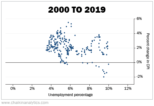
You can clearly see limitations of the Phillips Curve in this chart. It’s a mess…
The bottom portion captures the period around the 2008 financial crisis.
You might be able to make out a horizontal trend line centered at 2.5% to 3% on the CPI. But ultimately, if you’re as unimpressed as I am, you’re in good company…
In July 2019, Fed Chair Jerome Powell told Congress that the Phillips Curve theory is all but dead…
[It’s] weaker and weaker and weaker to the point where it’s a faint heartbeat.
The Phillips Curve is not what it used to be. And that breakdown has fueled a shift…
Economists are looking beyond traditional unemployment and inflation data. They’re also analyzing the expectations tied to those variables.
That’s what folks like Powell are using to frame today’s monetary policy. In his own words…
[Because] inflation expectations are so settled… that’s what we think drives inflation.
But it’s not a simple task…
The Fed is still working to achieve its inflation goals. To do that, it needs to address both the causes of record inflation and general expectations about prices.
So we don’t really need a deep recession or depression to cut inflation – unless we really want one.
Good investing,
Marc Gerstein