How do you know if the Power Gauge works?
People ask me that question all the time. And every time, my answer is simple…
Just look at the chart.
You see, many investors are skeptical. They don’t think anything can help them anticipate the market’s next move – at least not consistently.
The mainstream media reinforces this mantra…
To them, the market is a flowing river. And like a rafter, you’re just along for the ride.
But at the same time, we all know Wall Street analysts use many different tools to interpret data and make predictions. They’re certainly not just riding down the river on a raft.
For everyday investors, this situation winds up creating something called “cognitive dissonance” – or the mental toll of facing conflicting information. And it’s not your fault.
Today, I want to clear the air with a compelling chart from the financials sector…
You’ll see that this chart is about as clear as it gets. And with the Power Gauge at our side, we can continue making smart decisions even in today’s market environment…
Now, I know we’ve already run a couple essays about the recent banking crisis. And my colleague Marc Chaikin touched on the SPDR S&P Regional Banking Fund (KRE) yesterday.
But today, I want to zero in on this exchange-traded fund (“ETF”). That’s because the regional banking sector builds a very compelling case for the Power Gauge…
KRE holds shares of about 140 regional banks. And today, it has zero “bullish” stocks.
Importantly, before the banking crisis hit, the Power Gauge flashed a few key signals on this ETF. So again, if you’re wondering if the Power Gauge works, just look at the chart…
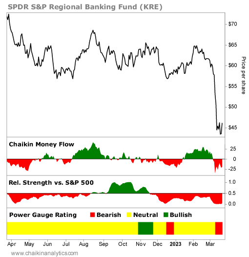
Specifically, I want to focus on the section that shows KRE’s relative strength…
Four months ago, on November 17, KRE experienced a negative relative strength change. That means the ETF started underperforming relative to the S&P 500 Index. And it’s evident with the red coloring on the chart. (You can review my take on relative strength here.)
Soon after that, the Power Gauge flashed a “bearish” signal on KRE. Again, you can see what I mean with the red coloring in the lowest panel on the above chart.
Now, look at the Chaikin Money Flow indicator…
This indicator shifted from green to red leading up to that signal. That means the “smart money” from institutional investors stopped flowing into KRE before things went south.
In other words, by just looking at the chart, folks could’ve avoided the pain in this space.
And importantly… you’ll notice that the chart is pointing toward more pain for KRE today.
The Power Gauge rates KRE as “bearish” today. The ETF’s relative strength is deep in the red. And the Chaikin Money Flow indicator shows that the smart money is running away.
Thanks to the Power Gauge, we could see that regional banks were in trouble long before the recent crisis. And as a result, we could’ve avoided the pain that many others endured.
The Power Gauge combines fundamental and technical indicators on a stock-by-stock basis. It helps everyday investors interpret the categories and factors that matter most to them.
What you get out of it depends on how you use that information.
But if you’re still wondering if the Power Gauge works, always remember…
Just look at the chart.
Good investing,
Pete Carmasino
Editor’s note: A new wave of volatility is changing everything. You don’t need to panic. But according to Chaikin Analytics founder Marc Chaikin, you do need to prepare immediately…
That’s why he’s hosting a special event next Tuesday, March 28, at 8 p.m. Eastern time.
Marc will share the one thing you need to do right now to protect your wealth – and still see massive gains – before the end of 2023. Just for tuning in, you’ll learn the name and ticker symbol of one of this top investment ideas. Plus, it’s FREE to attend. Click here to sign up.